


Now viewing: Home > Maps . #30DayMapChallenge
#30DayMapChallenge 2024
The #30DayMapChallenge is a daily social mapping project that happens every November.
The idea is to publish a map every day in November exploring different themes, designs, techniques and subjects. Over the next 30 days Apogee will share some new maps using MapInfo and some older maps that look back on projects that still bring me joy today. Maps aren't just about the "where" anymore they can be about the "what", "who" and the "when" as well - and possibly all of these things at once. Maps can be pieces of art, they can be informative, they can be practical, a single map isn't necessarily the same thing to all of us. So join Apogee on this journey through November and let us know what you think of our maps.
Official categories for 2024 are:
For more information on the categories please visit 30DayMapChallenge
For more information about these images or the data they contain please contact us.
Contains Ordnance Survey data © Crown copyright and database right 2024.
Day 01: Points
Day 02: Lines
Day 03: Polygons
Day 04: Hexagons
Day 05: A Journey
Day 06: Raster
Day 07: Vintage Style
Day 08: Data: HDX
Day 09: AI only
Day 10: Pen & Paper
Day 11: Arctic
Day 12: Time and Space
Day 13: A new tool
Day 14: A world map
Day 15: Data: My Data
Day 16: Choropleth
Day 17: Collaborative Map
Day 18: 3D
Day 19: Typography
Day 20: Data: OpenStreetMap
Day 21: Conflict
Day 22: 2 Colours
Day 23: Memory
Day 24: Only circular shapes
Day 25: Heat
Day 26: Map projections
Day 27: Micromapping
Day 28: The blue planet
Day 29: Data: overture
Day 30: The final map
 Day 01: PointsBack to basics for Day 1 with a map of points. The map shows the location of Electric Vehicle Chargepoints by postcode using Ordnance Survey CodePoint OpenData. |  Day 02: LinesAn alternative London Underground map creates in 2002 as part of my MSc at UCL. The map balanced the actual geographical location of the stations against their locations on the original tube map designed by Harry Beck in 1933. The map shown here used a bidimensional regression technique that aimed to find the “best-fit” when mapping from the Beck map to the real-world locations of the stations. |  Day 03: PolygonsDistribution of EV Chargepoints in the South East. Using different distribution of the data and combining with other datasets demonstrates how it can change the effectiveness of a map. |
|---|---|---|
 Day 04: HexagonsHexagons are a great way to represent data coverage as they tessellate. The data shown in the images below is BGS GeoSure 5km HexGrid data available from OS OpenData and British Geological Survey. The datasets provide an overview of the susceptibility to six naturally occurring geohazards in Great Britain. Contains public sector information licensed under the Open Government Licence v3.0. |  Day 05: A JourneyThe journey shows my route from my current home town in Kent back to near where I grew up. The maps shows all of the locations of Chargepoints that are within 2km of the motorway junctions along the route. And although unlikely to need to charge an EV on such a short route it is satisfying to know that there are plenty of options. |  Day 06: RasterToday's map show cases the #OrdnanceSurvey #GBOverview map which is freely downloadable from the OS Data Hub. This map provides a classic background for any GB datasets enhancing the data presentation. |
 Day 07: VintageThe map below shows the locations of Primary Schools in Kent but really the subject is irrelevant it’s all about the styling. |  Day 08: HDXData from the Humanitarian Data Exchange (HDX) showing population change in Ukraine. |  Day 09: AI OnlyUsing www.craiyon.com I asked the AI to draw me a treasure map! |
 Day 10: Pen & PaperA stylised map of the local steam railway KESR. |  Day 11: ArcticViewing the world from a different perspective. | 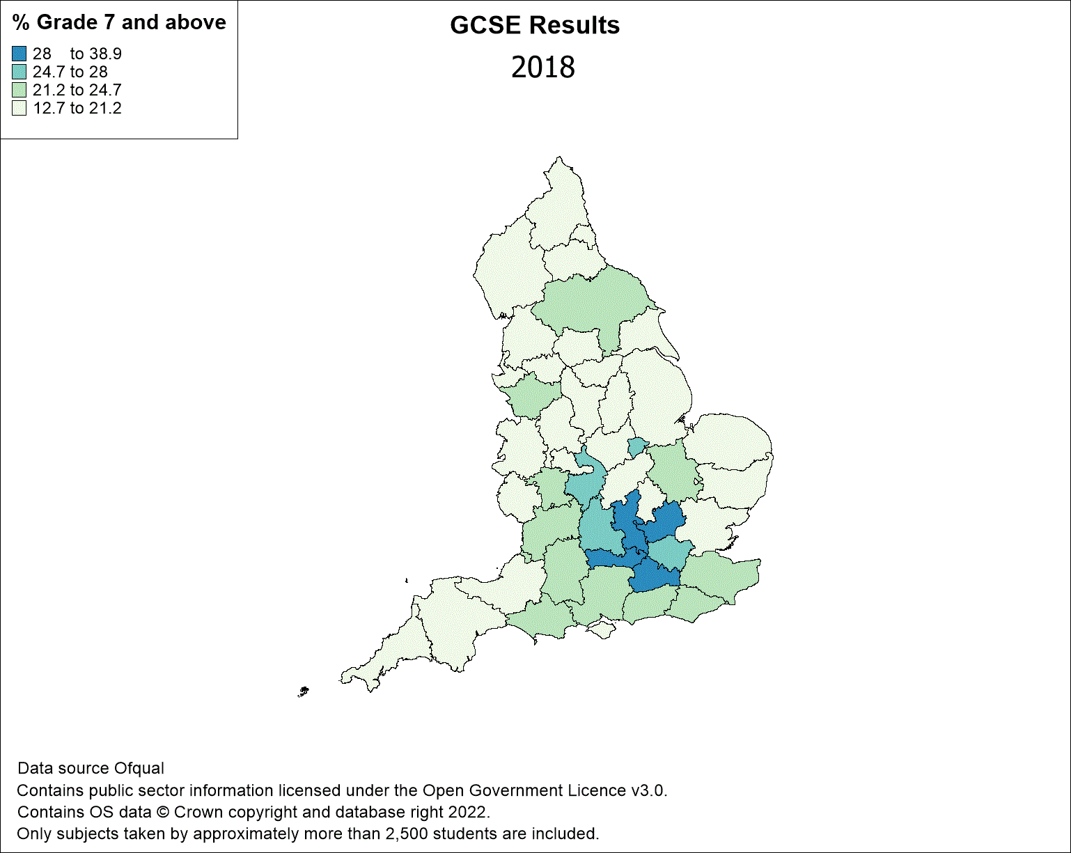 Day 12: Time & SpaceHow GCSE results varied before and after the Covid pandemic. |
 Day13: New ToolUsed QGIS to recreate the Journey map from Day 5. |  Day14: The WorldImage shows major cities across the world within 20km of country border. |  Day15: My DataMap shows the places I have been fortunate enough to go to for work. |
 Day 16: ChoroplethThematic map showing the techniques used to highlight an area of interest. |  Day 18: Elevation |  Day 19: Typography |
 Day 20: OSM |  Day21: Conflict |  Day 22: Colours |
 Day 23: Memory |  Day 24: Circles |  Day 25: Heat |
 Day 26: Projections |  Day 27: Micro |  Day 28: Blue Planet |
 Day 29: Overture |