


GCSE Results
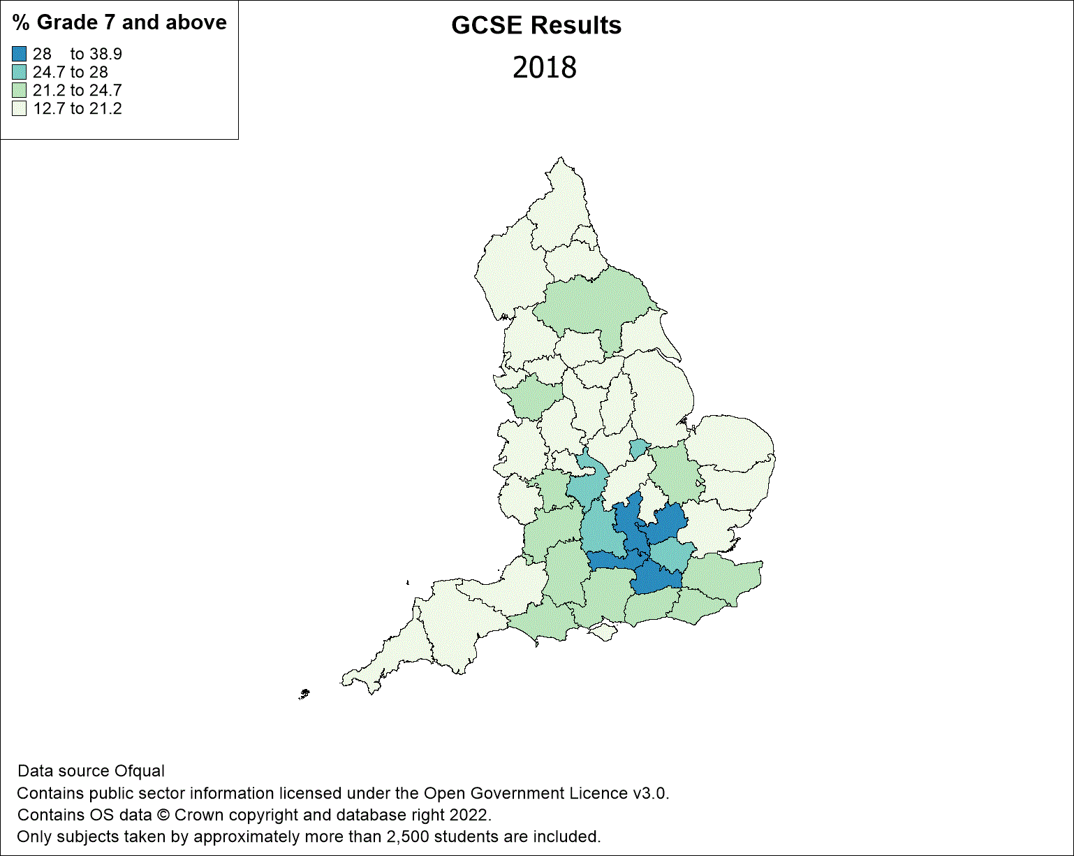
This map shows how the rate of GCSE passes awarded at grade 7 and above vary across the country. However, unlike a static map it also shows how this pass rate varied over time from 2018 to 2022. This is known as temporal mapping and can be applied to multiple industries.
It was created using the Time Series feature in MapInfo Pro. The data used in this map is available from Ofqual and is licensed under the Open Government Licence v3.0. The county boundaries is an OS Open Boundary Line dataset and can be downloaded from the OS website.
There were five separate datasets for each year of the analysis, these were linked to the county boundary objects and combined into one table. In order to create a temporal map your data must have a column which is either of type "Date", "Time" or "Date/Time". Add the data to the map and MapInfo Pro enables you to add a Time Series to it. There are various options which allow you to present your data variation over time. Once complete the finished map can be exported as an animated GIF file and used in presentations and on web-sites for maximum impact.
For more information about temporal mapping and how it can provide valuable insight into your business please contact us.